

Menu
- About
- For Faculty and Staff
- Visual Identity
Back to Top Nav
Back to Top Nav
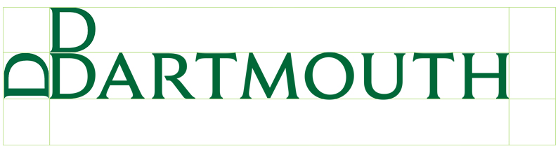
The Dartmouth wordmark is deeply rooted in the College's heritage and culture with much consideration of how it will live in a digital world.
Before starting your project or hiring a design firm, please contact the Office of Communications. We will work with you to understand your needs, answer your questions, and help you work within our brand guidelines.
The wordmark was created from a modernized version of a typeface designed by Rudolph Ruzicka, first shown in Studies in Type Design, published by the Dartmouth Library in 1968.
Ruzicka was a Czech-born illustrator, etcher, and book and typeface designer. His work can be seen on the Dartmouth Medal and the bicentennial seal. Ruzicka's original typeface design features inscription-style caps and distinct, tapered serifs. These carefully crafted details create a voice that is both elegant and authoritative.
The wordmark can be downloaded by Dartmouth faculty, staff, and students. You will need to log in with your Dartmouth NetID to access the wordmark.
The wordmark should be displayed prominently and clearly to maximize its impact. It is important to both display the wordmark with a clear space around all four sides and to adhere to the recommended color combinations in order to maintain the brand consistency and integrity.
The minimum amount of clear space required around the wordmark is defined by the height of the "D."
When printed, the wordmark must be at least 0.75" wide in order to be completely legible. When displayed digitally, the wordmark must be at least 100 pixels wide in order to be legible.
We recommend using the wordmark in primary colors, secondary colors, and Spring Green from the tertiary palette. Unless placed on a photo, the wordmark should always be accompanied by the presence of Dartmouth Green.
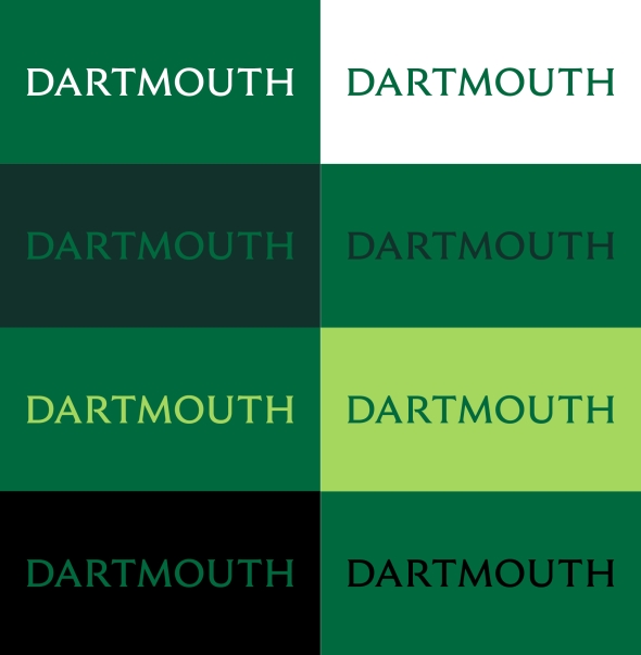
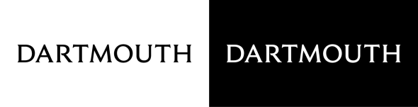
In grayscale or black and white documents, the wordmark should appear knocked out or in black.
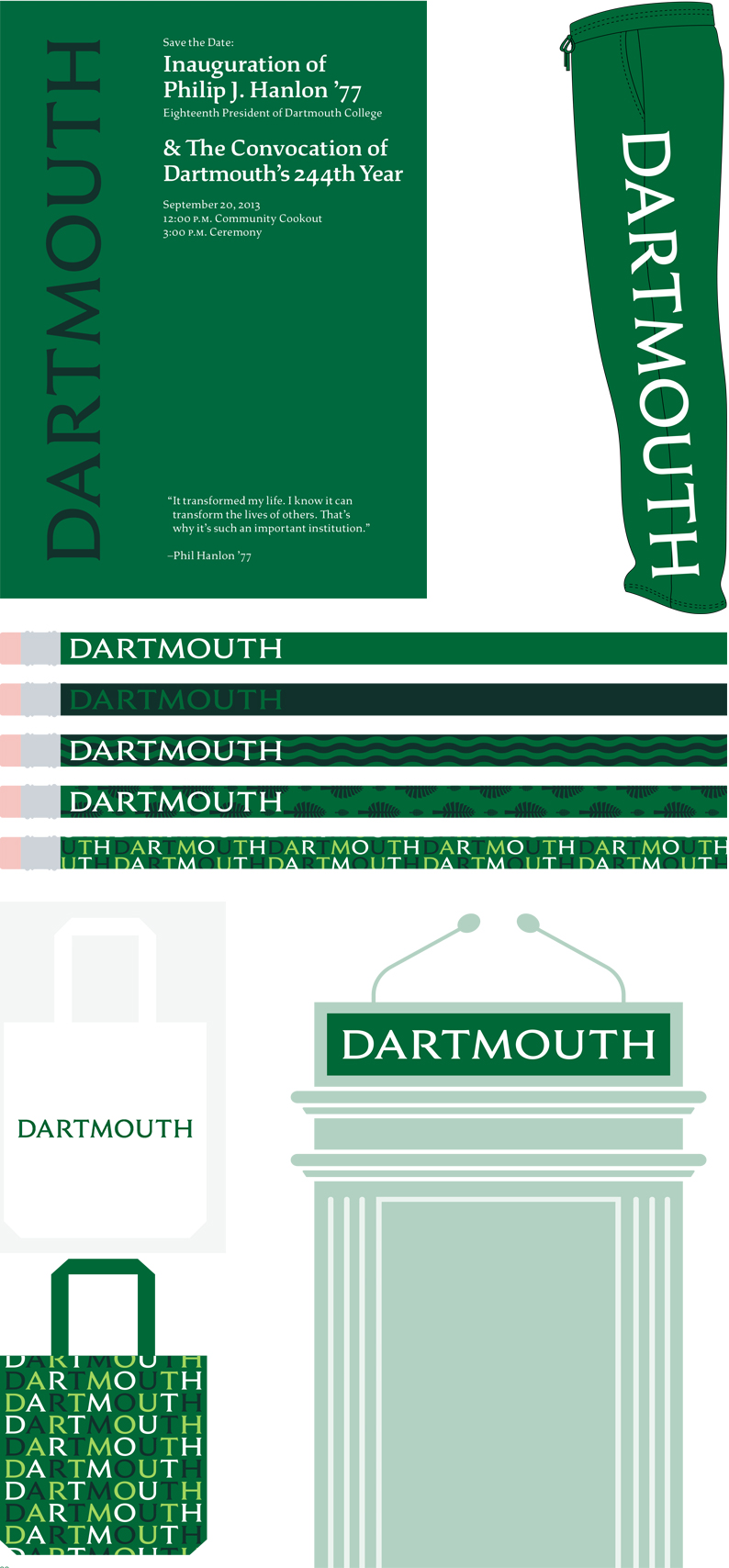
Use the examples below as a guide to using the wordmark effectively. They show a range of applications from expressive to official. Horizontal formats are a great opportunity to use the wordmark at a large, bold size, while patterns can be used in a more informal setting.
Copyright of the Trustees of Dartmouth College.