

Menu
- About
- For Faculty and Staff
- Visual Identity
Back to Top Nav
Back to Top Nav
The Dartmouth insignias have a history as rich and intricate as the College itself. They have evolved over the years to maintain relevance and better illustrate Dartmouth's values. The Dartmouth Pine (or D-Pine) is the newest addition to the brand family—created with the intention of honoring Dartmouth's legacy while looking forward to what the future brings.
Before starting your project or hiring a design firm, please contact the Office of Communications. We will work with you to understand your needs, answer your questions, and help you work within our brand guidelines.
The D-Pine, Lone Pine, and D-Pine with the wordmark can be downloaded by Dartmouth faculty, staff, and students. You will need to log in with your Dartmouth NetID to access the files.
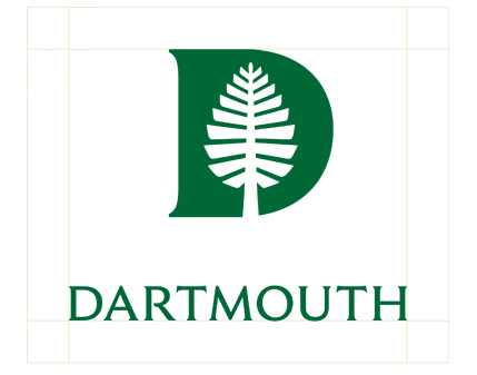
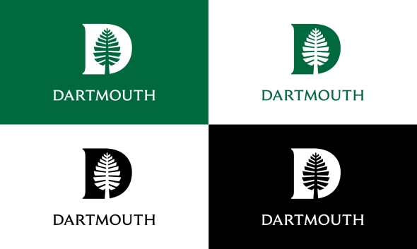
Combining the Lone Pine and the D from the wordmark creates the Dartmouth Pine (or D-Pine), a new brand mark that is distinctively Dartmouth. The D-Pine is equal in stature to the Dartmouth wordmark and may be used in any instance where the wordmark would be appropriate.
The minimum amount of clear space required around the D-Pine is defined by one-quarter of its height.
When printed, the D-Pine must be at least 0.25" wide in order to be legible. When displayed digitally, the D-Pine must be at least 30 pixels wide in order to be legible.
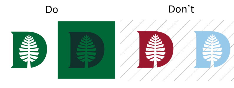
We recommend using the D-Pine in primary colors, secondary colors, and Spring Green from the tertiary palette. Unless placed on a photo, the D-Pine should always be accompanied by Dartmouth Green.
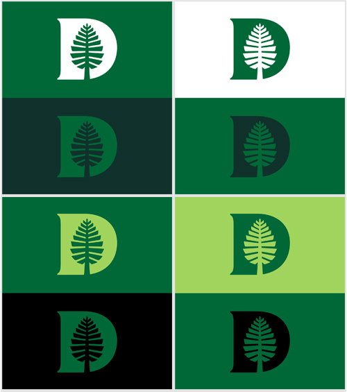
In grayscale or black and white documents, the D-Pine should appear knocked out or in black.

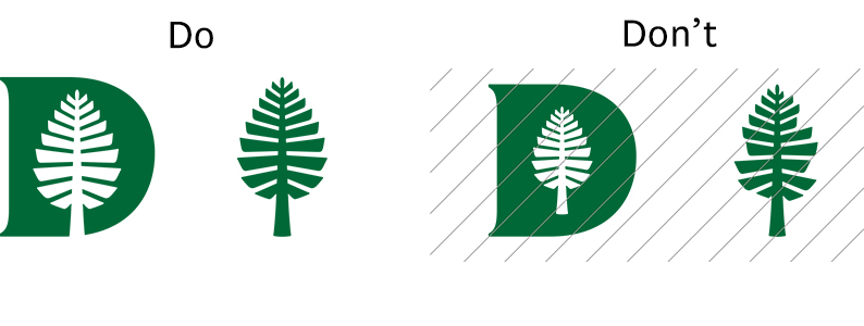
Application of the D-Pine should reflect its status as the most formal brand mark. It should only be used on official Dartmouth materials, and never altered from its original form. The D-Pine works best when displayed boldly and confidently.
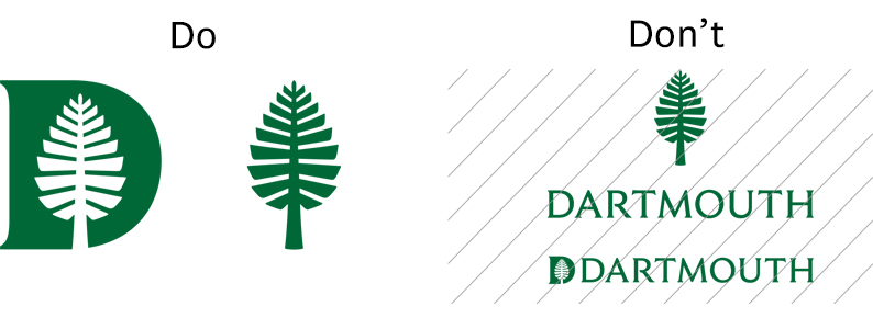
When using the D-Pine with the wordmark on the same document or object, it is strongly recommended that they appear separately to retain their individual meaning and impact.
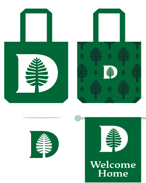
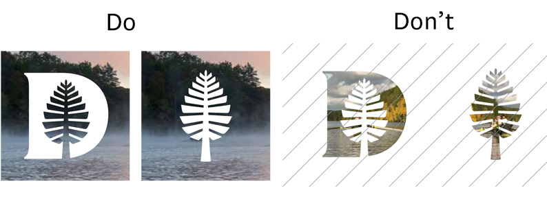
The D-Pine can be used on Dartmouth posters, flyers, etc., in a secondary manner to indicate an official status. When using the D-Pine on an image, take care to place the image so that it does not obscure the pine within the brand mark.

It is always preferred that the D-Pine and wordmark appear on materials separately. In instances when this is not possible the lockup may be used. A lockup is the intentional arrangement of a logo and its accompanying elements. In this case, the lockup refers to the pairing of the Dartmouth wordmark the D-Pine, shown below. The relationship between size and space of each element has been considered at length and should not be altered.
Lockup Spacing
The minimum amount of clear space required around the lockup is defined by one-quarter of the D-Pine height.
Recommended Color Combinations for the Lockup
We recommend using the lockup in Dartmouth Green or on a Dartmouth Green background if knocked out. Unless placed on a photo, the lockup should always be accompanied by the presence of Dartmouth Green. In grayscale or black and white documents, the lockup should appear knocked out or in black.
We recommend using this lockup on materials when it is not possible to use the D-Pine and wordmark separately, and both should both appear but space is limited.
Originally known as the Old Pine, the Lone Pine is one of the most enduring symbols of Dartmouth's history, lore, and traditions. The tree was known as a gathering spot for seniors in the early 1800s before being cut down in 1895 due to damage from lightning strikes and storms.
John Scotford designed the original icon for Dartmouth's bicentennial materials. The modern version has been refined to have greater consistency and legibility at small sizes.
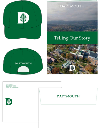
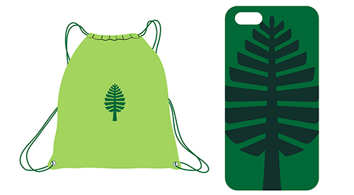
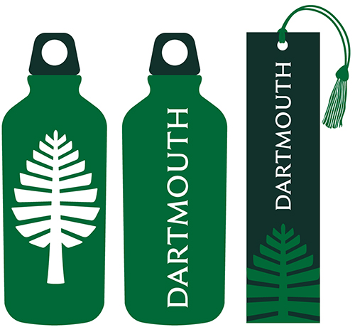
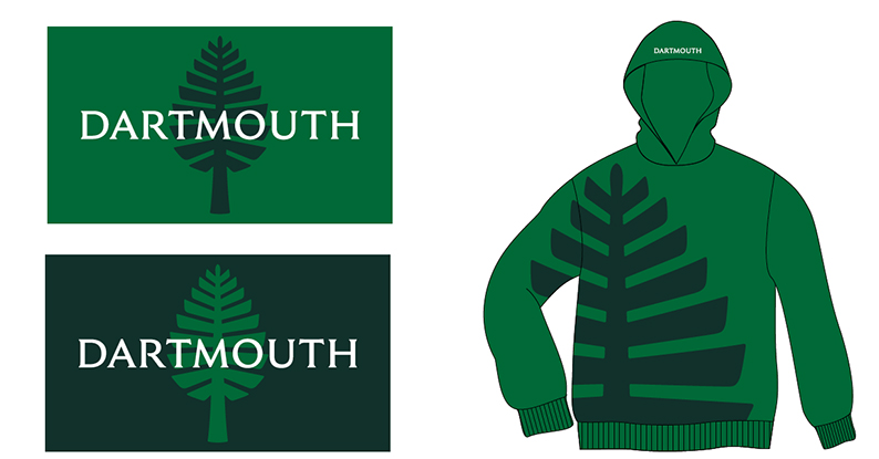
The Lone Pine is an informal icon that may be used on merchandise, day-to-day communications, and any other school-affiliated materials. It has less stringent rules than the other brand elements and can be used in a more expressive manner.
The minimum amount of clear space required around the Lone Pine is defined by one-quarter of its height. The exception to this rule is when a cropped version of the Lone Pine is being used.

When using the crops shown or creating your own, it is important to show enough space around the icon so it is still recognizable as the Lone Pine. Moving the brandmark away from the center of the layout or using it in an asymmetrical way can create a more dynamic composition.
Vertical Cropping

Asymmetrical Vertical Cropping

Horizontal Cropping

Asymmetrical Horizontal Cropping

Because the Lone Pine is the least formal of Dartmouth's brand marks, it may be used creatively to help enhance or illustrate posters, flyers, or other communications. See below for some possible examples, both with and without the wordmark.

When pairing the Lone Pine with the Dartmouth wordmark, the two should compliment one another without creating a lockup.
Care should always be taken to ensure that the brand marks are recognizable and easily identified.
Don't alter, redesign, warp, or otherwise distort the brand marks in any way.
Don't create unapproved lockups with the wordmark.
Don't place images within the brand marks.
Don't use the D-Pine in tertiary colors (with the exception of Spring Green).
Copyright of the Trustees of Dartmouth College.