Dos and Don’ts
Care should always be taken to ensure that the brand marks are recognizable and easily identified. For Dartmouth brand consistency and to avoid confusion or dilution of our trademark, we do not allow any modification to our marks. Use of the trademark means proper use of the registered mark as shown in the registration. Use of a mark must be exactly as represented in the trademark registration. If the mark is frequently used incorrectly Dartmouth’s rights in key brand elements could be impacted.
Before starting your project or hiring a design firm, please contact us. We will work with you to understand your needs, answer your questions, and help you work within our brand guidelines.
Department/Office logos
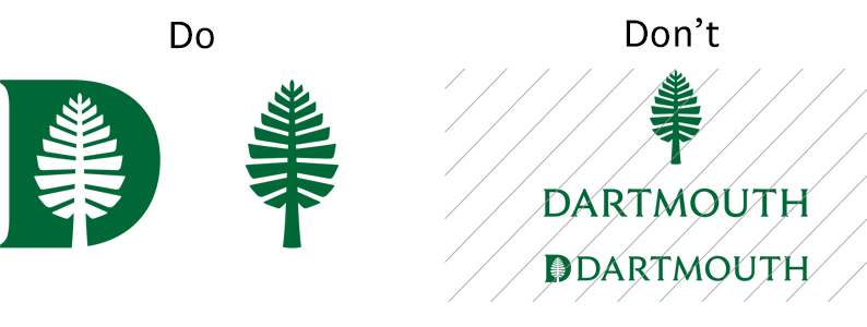
Don't create alternate lockups using the wordmark or D-Pine, or alter the relationships of the existing lockups. This includes changing the placement and typeface.

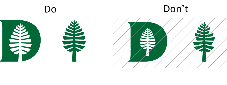
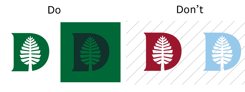
Brand Marks
Don't alter, redesign, warp, or otherwise distort the brand marks in any way.
Don't create unapproved lockups with the wordmark.
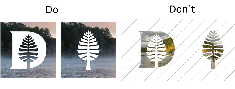
Don't place images within the brand marks.
Don't use the D-Pine in tertiary colors (with the exception of Spring Green).
Wordmark
The Dartmouth wordmark should not be altered in any case. See below for specific examples of dos and don’ts.
- Don’t use the wordmark within body text.
- Don't type the wordmark in all caps Ruzicka.
- Don’t use any colors outside the approved palette.
- Don’t outline the wordmark.
- Don’t put a drop shadow on the wordmark.
- Don’t create unapproved lockups.
- Don’t alter the letter spacing of the wordmark.
- Don’t place an image within the wordmark.
- Don’t stretch, condense or otherwise distort the wordmark.
- Don’t obscure the legibility of the wordmark when placing it on photos.
- Don’t use the multicolored wordmark without the surrounding pattern.
Typography
Use of Uppercase
Avoid using capitals for emphasis. Instead, create hierarchy through weight and size changes.
Do not set both a title and subtitle in capitals. Instead, use changes in weight and scale to express hierarchy.
Use of Bold Text
Avoid setting body text in bold.
Avoid setting both a title and subtitle in bold text.
Improper Leading
Too little leading results in text that feels cramped, with ascenders and descenders colliding. Too much leading becomes distracting and difficult to read.
Text size
When using different sizes for text, avoid using sizes that are too similar. Make sure the sizes are different enough to display a healthy amount of contrast.
Color
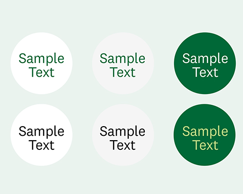
Recommend usage for Primary Page Elements
We recommend these text and background color combinations for the main pages and primary elements of the site.
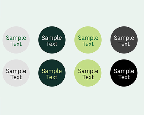
Secondary Page Elements
We recommend these text and background color combinations for secondary webpage elements.
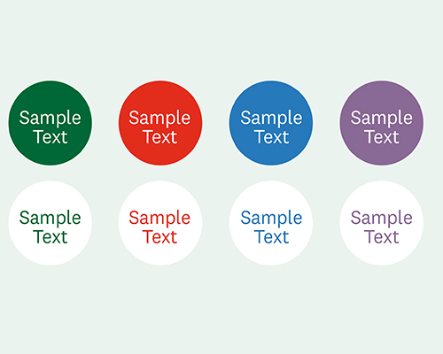
Buttons/Links
We recommend these text and background color combinations for buttons, links, and call outs on web pages.
The Dartmouth palette should not be altered in any case.
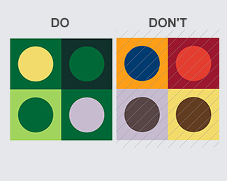
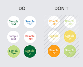
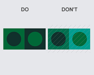
Don't use secondary or tertiary colors without the presence of Dartmouth Green.
Don't use Summer Yellow, Spring Green, or Bonfire Orange on the website with Snow White. These combinations do not meet WCAG standards and are not legible for everyone.