Brand Marks
The Dartmouth insignias have a rich history. They have evolved over the years to maintain relevance and better illustrate Dartmouth's values.
Before starting your project or hiring a design firm, please contact us. We will work with you to understand your needs, answer your questions, and help you work within our brand guidelines.
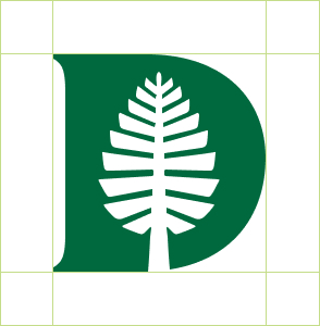
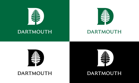
The Dartmouth Pine
Combining the Lone Pine and the D from the wordmark creates the Dartmouth Pine (or D-Pine), a new brand mark that is distinctively Dartmouth. The D-Pine is equal in stature to the Dartmouth wordmark and may be used in any instance where the wordmark would be appropriate.
Spacing
The minimum amount of clear space required around the D-Pine is defined by one-quarter of its height.
Minimum Size
When printed, the D-Pine must be at least 0.25" wide in order to be legible. When displayed digitally, the D-Pine must be at least 30 pixels wide in order to be legible.
Recommended Color Combinations
We recommend using the D-Pine in primary colors, secondary colors, and Spring Green from the tertiary palette. Unless placed on a photo, the D-Pine should always be accompanied by Dartmouth Green.
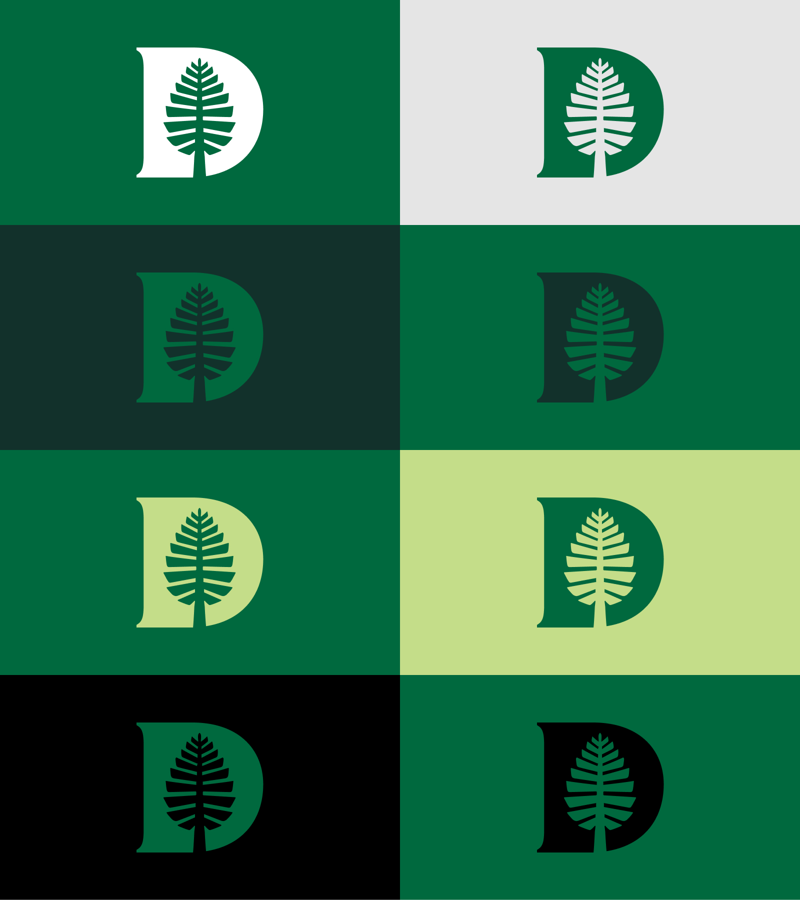
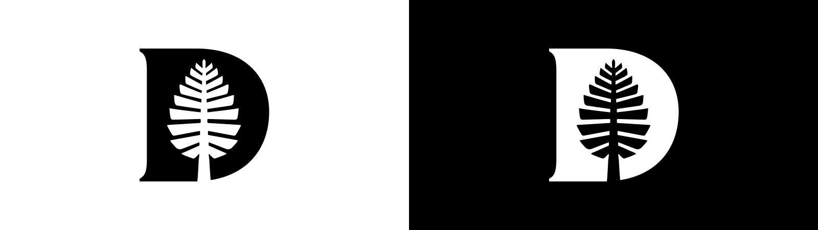
In grayscale or black and white documents, the D-Pine should appear knocked out or in black.
D-Pine Applications
Application of the D-Pine should reflect its status as the most formal brand mark. It should only be used on official Dartmouth materials, and never altered from its original form. The D-Pine works best when displayed boldly and confidently.
Download the Dartmouth D-Pine
The D-Pine With the Wordmark
When using the D-Pine with the wordmark on the same document or object, it is strongly recommended that they appear separately to retain their individual meaning and impact.
Secondary Use
The D-Pine can be used on Dartmouth posters, flyers, etc., in a secondary manner to indicate an official status. When using the D-Pine on an image, take care to place the image so that it does not obscure the pine within the brand mark.
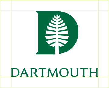
The Lockup
It is always preferred that the D-Pine and wordmark appear on materials separately. In instances when this is not possible the lockup may be used. A lockup is the intentional arrangement of a logo and its accompanying elements. In this case, the lockup refers to the pairing of the Dartmouth wordmark the D-Pine, shown below. The relationship between size and space of each element has been considered at length and should not be altered.
Lockup Spacing
The minimum amount of clear space required around the lockup is defined by one-quarter of the D-Pine height.
Recommended Color Combinations for the Lockup
We recommend using the lockup in Dartmouth Green or on a Dartmouth Green background if knocked out. Unless placed on a photo, the lockup should always be accompanied by the presence of Dartmouth Green. In grayscale or black and white documents, the lockup should appear knocked out or in black.
Download the D-Pine with the Wordmark
The Lone Pine
Originally known as the Old Pine, the Lone Pine is one of the most enduring symbols of Dartmouth's history, lore, and traditions. The tree was known as a gathering spot for seniors in the early 1800s before being cut down in 1895 due to damage from lightning strikes and storms.
John Scotford designed the original icon for Dartmouth's bicentennial materials. The modern version has been refined to have greater consistency and legibility at small sizes.
The Lone Pine is an informal icon that may be used on merchandise, day-to-day communications, and any other school-affiliated materials. It has less stringent rules than the other brand elements and can be used in a more expressive manner.

Spacing
The minimum amount of clear space required around the Lone Pine is defined by one-quarter of its height. The exception to this rule is when a cropped version of the Lone Pine is being used.
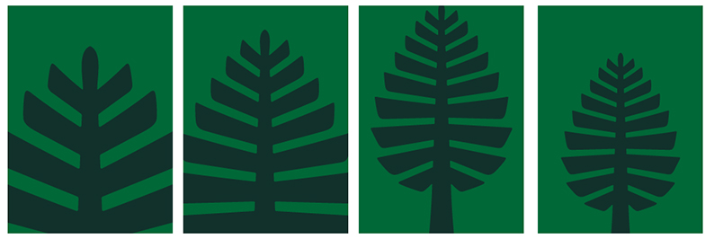
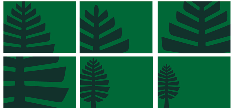
Cropping the Lone Pine
When using the crops shown or creating your own, it is important to show enough space around the icon so it is still recognizable as the Lone Pine. Moving the brandmark away from the center of the layout or using it in an asymmetrical way can create a more dynamic composition.
Vertical Cropping
Asymmetrical Vertical Cropping

Horizontal Cropping

Asymmetrical Horizontal Cropping
Lone Pine Applications
Because the Lone Pine is the least formal of Dartmouth's brand marks, it may be used creatively to help enhance or illustrate posters, flyers, or other communications.
Download the Lone Pine
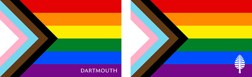
LGBTQIA+ Flags
To celebrate the diversity of the LGBTQIA+ community, we have two Dartmouth Pride flags. Both flags use the Progress Pride flag, designed in 2018 by Daniel Quasar, and include either the Dartmouth Wordmark or Lone Pine.
Download the LGBTQIA+ Flags

Guidance
Ask us about brand guidelines
Before starting your project or hiring a design firm, please contact us. We will work with you to understand your needs, answer your questions, and help you work within our brand guidelines.