Dartmouth Typefaces
The typefaces at the core of the Dartmouth brand are Dartmouth Ruzicka and National 2. Whether used separately or together, they are essential in creating a brand voice that is distinctly Dartmouth.
Before starting your project or hiring a design firm, please contact us. We will work with you to understand your needs, answer your questions, and help you work within our brand guidelines.
Dartmouth Ruzicka
Originally designed by Rudolph Ruzicka, Dartmouth Ruzicka is a typeface that speaks to the legacy and history of Dartmouth. Type designer Jesse Ragan picked up where Ruzicka left off to modernize Ruzicka's typeface and bring it into the 21st century. Using Dartmouth Ruzicka as the main typeface for communication materials highlights the cultured, scholarly side of the College.
Download Dartmouth Ruzicka
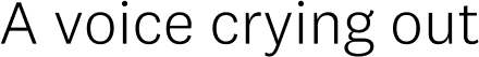
Examples of Dartmouth Ruzicka
Dartmouth Ruzicka Regular

Dartmouth Ruzicka Semibold

Dartmouth Ruzicka bold

National 2
National 2 is a deceptively simple sans-serif with subtle details that give it a distinctive, but not distracting, personality. While National 2 travels through and touches on a lot of historical material, it is designed to thrive in our contemporary typographic climate. Using National 2 as the main typeface on communication materials plays up the strong, bold spirit of the Dartmouth brand.
Download National 2
National 2 Restrictions
The font license does not allow Dartmouth to distribute National 2 to freelancers, vendors or Alumni (other than to printers who are working on projects for Dartmouth offices). For projects currently underway, vendors can be reimbursed if they purchased the license to complete a Dartmouth project. National 2 can be purchased from the font foundry Klim.
Examples of National 2
National 2 Light
National 2 Regular
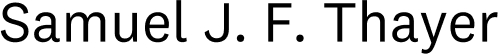
National 2 Medium

National 2 Bold

National 2 Extrabold

Alternative Typefaces
We strongly recommend using Dartmouth Ruzicka and National 2 whenever possible. When this is not possible, we recommend the following alternate fonts:
Georgia or EB Garamond (specifically for Google projects) in place of Dartmouth Ruzicka and Arial in place of National 2.
Aptos can also be used in place of National 2. Aptos is the default font across all Microsoft Office applications.
Glyphs
Both Dartmouth Ruzicka and National 2 include alternate glyphs, including tabular figures, ligatures, fractions, small caps, the extended Latin alphabet, superscripts, and subscripts. These extra glyphs or characters allow for greater customization and precision when setting text. Take advantage of these extra features to create a typographic landscape that is rich, varied, and legible.
Typography Styling
Different combinations of the typefaces evoke different facets of Dartmouth's personality. Dartmouth Ruzicka communicates the legacy and prestige of the college while National 2 has a clean, modern presence. No matter which combination of typefaces you choose, always use contrasting weights and sizes to create a hierarchy of information.
Use the styling recommendations below as a guide to setting bodies of text that are attractive, comfortably read, and consistent.
Align Left
When setting text for day-to-day communications, we generally advise aligning left so the straight edge of the text is to the left.
Line Length
Text is read most comfortably when set in a line length of 40 to 65 characters.
Rules
When using rules with text, we recommend a line thickness of .25 or .5pt. Lines that are too heavy become a distraction to the text.
Leading
Leading is the space between the lines of text. When setting the leading for body text always ensure the leading size is larger than the type size, and the text is comfortable to read.
Hanging Punctuation
When using quote marks, set them in the margin so the flow of text is not interrupted.
Hierarchy
Using just two typefaces, we're able to create a variety of ways to express hierarchy through weight and size changes.